Wednesday, May 14, 2014

Introducing DynamicXray

Today I would like to introduce DynamicXray, a UIKit Dynamics runtime visualisation and introspection library for iOS.


Overview

If you have done any work with UIKit Dynamics you may have found that it can be difficult to debug and fine tune the behaviour. UIKit Dynamics is driven by a rigid body physics engine (Box2D in fact) which gives the developer a lot of power, but the abstract nature of the framework can make it difficult to see under the hood of the physics simulation.

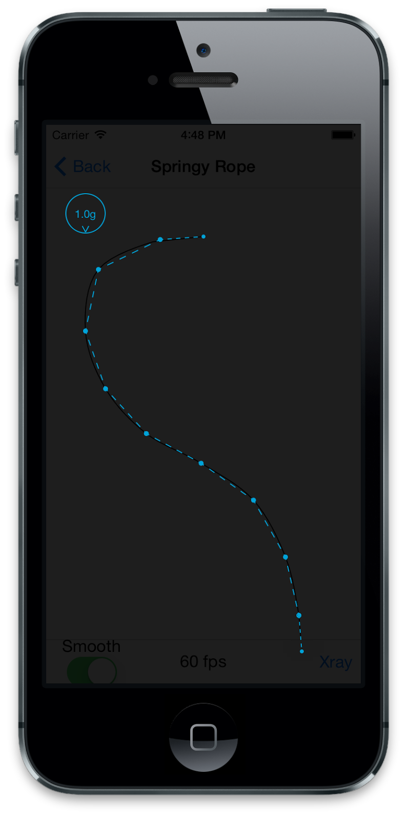
DynamicXray provides a live overlay of all dynamic behaviours and dynamic items at runtime, allowing you to visualise and introspect the underlying physics simulation as it is running. DynamicXray works on both devices and simulators.


Integration

DynamicXray is implemented as a UIDynamicBehavior. This means it can be simply added to any UIDynamicAnimator to enable the introspection overlay. By default, all behaviours added to the animator will be visualised.

For example:


#import <DynamicXray/DynamicXray.h>
...
DynamicXray *xray = [[DynamicXray alloc] init];
[self.dynamicAnimator addBehavior:xray];


For more control, the DynamicXray behaviour exposes options such as temporarily disabling the overlay, adjusting the cross fade between app and overlay, whether to draw dynamic item outlines, and more. 


Features

DynamicXray features include:

  • Easy and controllable integration. Simply add the DynamicXray behavior to your dynamic animator.
  • All UIKit Dynamic behaviours are visualised, including collision boundaries.
  • Visually differentiate between springy and rigid attachment behaviours.
  • Push behaviours are visualised by arrows representing the location, magnitude and direction of the push force.
  • Snap behaviours are visualised by arrows showing where the item is snapping to.
  • Gravity behaviours are visualised by an overlay showing magnitude and direction.
  • All dynamic item bodies in the scene are visualised.
  • Any contacts between dynamic items and other items or collision boundaries are highlighted.
  • Configurable overlay cross fade control for fading anywhere between 100% application to 100% DynamicXray overlay.
  • Built-in configuration panel for user to control run-time options.

Configuration Panel

As mentioned above, DynamicXray includes a built-in configuration panel to allow users to control some of the options at runtime. The configuration panel can be presented by calling -[DynamicXray presentConfigurationViewController].

For example:

DynamicXray *xray = [[DynamicXray alloc] init];
[self.dynamicAnimator addBehavior:xray];
[xray presentConfigurationViewController];


DynamicXray Catalog

The DynamicXray source repository includes a universal iOS app containing various UIKit Dynamics demonstrations. The demos in DynamicXray Catalog were created by various authors and are all open source. The demos include DynamicXray pre-loaded so introspection can be enabled on any demo to see the inner workings.

If you are interested in seeing more uses of UIKit Dynamics then take a look at DynamicXray Catalog. UIKit Pinball in particular is an interesting example of why not to use UIKit Dynamics for games.

I plan to continue adding interesting demos as I find them. Please submit a pull request if you would like to contribute a UIKit Dynamics demo to the catalog.


Videos

See more DynamicXray demonstration videos on YouTube.


Get It

DynamicXray is free and open source.

Download the DynamicXray framework and learn more at http://dynamicxray.net/

Download the source code from https://github.com/chrismiles/DynamicXray

Follow @DynamicXray and @chrismiles on Twitter.

Friday, May 2, 2014

Skala Color: a modern OS X colour picker for designers and developers

Recently I worked with the awesomely smart team at Bjango to help them build a new Mac tool. Here it is, Skala Color.

Skala Color is a Mac OS X colour picker plugin. When installed, it sits right beside the built-in colour pickers that everyone is used to like the colour wheel and the crayon selector.

What stands Skala Color apart is its attention to detail. Skala Color was built for the modern Mac OS X environment, with Retina display crispness and carefully crafted animations for a smooth experience.

Skala Color was designed by Marc Edwards to cater for modern designers and developers. Colour selection can be made all within the main gradient area by dragging a circular loupe. Vertical drag selects brightness, horizontal drag selects saturation. Dragging the small handle around the loupe selects the hue.

For finer control, hue can also be selected by the slider below the main gradient area. The slider has a clever fine control mode which becomes visible when dragging the handle. Drag the handle up into the fine control area to get 4x precision hue selection.

When opacity selection is available, a second fine control slider is presented below the hue slider, allowing the same precision selection of opacity level.

Below the colour/opacity selection controls, some real smarts come into play. Alongside preset black and white buttons, a third button is shown if the system clipboard contains any recognisable colours. Skala Color is clever about parsing colours from the clipboard. Many text formats are recognisable just by copying them to the clipboard. Here are some example text formats that it will recognise and automatically convert to colours:

  • #FF7A18
  • rgba(255, 122, 24, 1)
  • [UIColor colorWithRed:0.999 green:0.479 blue:0.095 alpha:1]
  • [NSColor colorWithDeviceHue:0.071 saturation:0.905 brightness:0.999 alpha:1]

Similarly, colours can be exported to a variety of different text formats. All main colour formats that are useful to web and Cocoa developers are supported. As a developer, rather than a designer, this is a feature I use a lot.

Bjango has released Skala Color for free, to help promote their upcoming product Skala. I urge you to check it out.

Tuesday, February 4, 2014

OpenGL ES for iOS Presentation Videos

At the last Swipe Conference I presented two talks on OpenGL ES for iOS developers. I have now published these presentation videos for anyone to watch. I hope they might be useful resources for the iOS community.

The first presentation, "Part 1: Learning to draw", was aimed at OpenGL noobs. I introduced the basics of OpenGL programming, rendering triangles, applying colours and lighting, and animating vertices. All using GLKit, which was introduced in iOS 5.  I also very briefly introduced OpenGL ES 2.0 shader programming and then used all the concepts to dissect Xcode's iOS OpenGL template project.

The second presentation, "Part 2: Rendering a masterpiece", covered more interesting rendering effects that GLKit makes very easy, such as textures, skyboxes and reflection maps. I demonstrated the tools that Apple provide for debugging, analysing and profiling OpenGL applications. I ended with a practical demonstration of some fancy custom storyboard segue transitions using OpenGL ES.

Even though the presentations were given in late 2012, all the material is still very relevant as the talks focussed on OpenGL ES 2.0 and GLKit, still the primary OpenGL technologies in iOS today. Recently, iOS 7 introduced support for OpenGL ES 3. However, OpenGL ES 3 requires the very latest hardware and so in practice you probably won't be adopting OpenGL ES 3 immediately or, if you do, will need an OpenGL ES 2.0 fallback path anyway.

You can watch the videos on YouTube:

Or watch them below where I have embedded them within the page, along with more details about what is covered.


OpenGL ES with iOS 5 - Part 1: Learning to draw by Chris Miles (Swipe Conference 2012)


An introduction to OpenGL ES and GLKit, aimed at iOS developers new to OpenGL programming. Presented at Swipe Conference 2012 by Chris Miles.

In the talk I cover:

* Setting up an OpenGL ES scene using GLKViewController + GLKView
* Rendering triangles (GL_TRIANGLES) and meshes made of triangles
* Applying vertex colours, using GLKBaseEffect
* Applying lighting, using GLKBaseEffect
* Using Vertex Array Objects (VAO) and Vertex Buffer Objects (VBO)
* Using interleaved vertex arrays (IVA)
* Animating vertex positions
* Very brief introduction to OpenGL ES 2.0 shader programming
* Dissection of Xcode's iOS OpenGL template project

To explain many of the concepts I use a small demo app, SwipeOpenGLTriangles. The full source to the demo app is released open source (MIT licensed) at https://github.com/chrismiles/SwipeOpenGLTriangles

The slides from the talk are available at https://speakerdeck.com/chrismiles/opengl-es-with-ios-5-part-1-learning-to-draw or http://chrismiles.info/presentations/SwipeConf-2012-OpenGL-ES-iOS5/Swipe-2012-OpenGL-ES-iOS5-Part1.pdf [PDF].


OpenGL ES with iOS 5 - Part 2: Rendering a masterpiece by Chris Miles (Swipe Conference 2012)


This is the second talk of two about OpenGL ES and GLKit, aimed at iOS developers. This talk covers rendering effects in OpenGL using GLKit, looking at the OpenGL debugging and profiling tools that ship with Xcode, and demonstrating how OpenGL can be used for some fancy segue transitions. Presented at Swipe Conference 2012 by Chris Miles.

In more detail, this talk covers:

* Rendering textured triangles using GLKTextureLoader and GLKBaseEffect;
* Creating cubemaps using GLKTextureLoader;
* Rendering skyboxes using GLKSkyboxEffect;
* Rendering reflection map effects using GLKReflectionMapEffect;
* Demonstration of the Xcode OpenGL ES frame debugger;
* Demonstration of the OpenGL ES Driver and Analyzer instruments;
* Demonstration of the OpenGL ES Performance Detective;
* Performance recommendations specific to OpenGL ES on iOS devices;
* Demonstration of some fancy custom storyboard segue transitions using OpenGL ES

The slides from the talk are available at https://speakerdeck.com/chrismiles/opengl-es-with-ios-5-part-2-rendering-a-masterpiece or http://chrismiles.info/presentations/SwipeConf-2012-OpenGL-ES-iOS5/Swipe-2012-OpenGL-ES-iOS5-Part2.pdf [PDF]

The demo apps used in the talk are all released open source.

SwipeOpenGLTriangles demonstrates rendering textured triangles  -- https://github.com/chrismiles/SwipeOpenGLTriangles

Swipe3D demonstrates GLKSkyboxEffect, GLKReflectionMapEffect, cubemap textures and indexed vertices -- https://github.com/chrismiles/Swipe3D

FancySegue shows how to build custom segue transitions using OpenGL -- https://github.com/chrismiles/FancySegue


I want to thank the Swipe Conference organisers for allowing me to edit and publish the videos myself.

Tuesday, January 14, 2014

Building a native iOS graphing engine for Pocket Weather 4

One of my favourite iOS apps is Pocket Weather Australia by Shifty Jelly who are a friendly little development team based in Adelaide. So it was an honour when they approached me to lend them a hand with development of their new version, overhauled and optimised for iOS 7: Pocket Weather 4.

Requirements


Specifically, my scope was to build a new, modern graphing engine for them, to replace the old legacy graphing code they had been using for years. An app like Pocket Weather lives or dies based on (a) Forecast data quality; and (b) Forecast data visualisations with rich graphs. Pocket Weather does both really well, visualising forecast data in a multitude of forms to cover many use cases. I couldn't help with their forecast data quality (which was already very high and even better in PW4) but I was happy to build a modern new high performant interactive graphing engine to cover their visualisation needs.

The graphing engine needed to support both static graphs as well as smooth scrolling interactive graphs, to cover all the visualisations that Pocket Weather 4 required. On iPhone, five main graphs were needed:
  • "Today": a static graph charting both air and "feels like" temperature forecasts, with "chance of rain" overlays.
  • "Detailed Outlook": a static graph charting forecast for the next two days, similar to the Today graph.
  • "Tide Times": a line chart of tide low/high forecast times, with edges nicely smooth out.
  • "Interactive Timeline": a scrolling graph charting air and "feels like" temperature forecasts, plus rain overlays, for the next 7 days.
  • "Interactive Tide Times": a scrolling graph of tide low/high forecast tides for the next few weeks.
Screenshots of two of the static graphs can be seen above, near the top. The interactive graphs are shown below.

Solution


There are a few iOS graphing libraries around that produce good results, both commercial and open source. However, third party library dependencies are always a trade off between convenience and managing extra baggage. Plus the ability and/or cost to customise them to meet requirements varies quite a bit. Based on the requirements, my preference was to hand-roll a graph rendering engine using native Core Graphics and Core Animation frameworks, rather than bring in a third party graphing library. Having had already done this a few times for previous projects, I was confident that we could get good results in a short time. This matched Shifty Jelly's preference also, as they would end up with modern code that they could own, manage and continue to customise themselves.


Technical


A common factor between all the required graphs was that they were all line graphs, charting either one or two lines of data, drawn with various styling options. As such it made sense to encapsulate line chart rendering in a class configurable enough to be shared by all the graph views. As some views would be drawing into UIView contexts (for static graphs) and others would be drawing into contexts at the CALayer level (for scrolling graphs, more on this below) that meant that the chart renderer could be a shared NSObject subclass, without any knowledge of the UIKit or CALayer levels. The chart renderer would talk Core Graphics, accepting a CGContext to render in to.

Above is an abstract diagram of the class architecture. Each graph view is a UIView subclass, with common elements abstracted into shared base classes, down to one base class for static graphs, and one for interactive graphs. Each graph view contains a chart renderer instance, configured appropriately for the particular graph type. Chart renderer objects were ultimately responsible for actually drawing the line graphs into specified CGContexts.

The static graph views were relatively straight forward. On "needs display" their drawRect: method delegates drawing to the chart renderer, passing down the CGContext to draw into.

The interactive graph views were a little more complex. They were very wide scrollable graphs. Rendering a large scrollable view is not possible, and would be very inefficient even if it was. The answer was to use a CATiledLayer to render the graph into tiles, on demand as the view is scrolled. CATiledLayer works great for this. Or would have, if it wasn't severely broken in iOS 7. In the end I had to roll my own CATiledLayer clone to get the job done, but the result was the same (more on this below).

Shown here are two images of an example scrollable graph view. The first image shows what the graph looks like rendered on screen. The second shows the view explosion, with all the subviews Revealed. You can see the large scrollable view, which cannot be snapshot by Reveal, but at runtime is rendered as horizontal tiles. The tiling layer renders tiles on demand, only drawing tiles as they become visible. Even then, rendering is performed asynchronously so as not to interrupt scrolling performance. Rendered tiles are then cached so they don't have to be drawn again unless necessary.


Challenges


As mentioned above, CATiledLayer is unfortunately broken in iOS 7.0 (rdar://15402066). It suffers a severe problem of not redrawing purged tiles in some cases. Easily reproducible and not shippable. After a discussion with Apple engineers via a TSI I concluded that the only practical current solution was to avoid CATiledLayer and write my own equivalent. I did that and it worked well for our case.

Another interesting challenge was the requirement to smooth the curves of the tide graphs, while also tracking the curved line path with a circular overlay when the graph is being scrolled. See the video below for an example of what I mean.


The tide data was a simple data set of low tide/high tide forecasts, in time order. For example: [low tide, high tide, low tide, high tide, ...]. By default the data would be graphed with sharp edges, as shown below in the first image. Shifty Jelly's rockstar designers understandably requested that the line be smoothed out, as shown in the second image below.
Techniques to smooth curves in a line are fairly well known and I used a Catmull-Rom spline to smooth the line.

The Catmull-Rom spline generated enough points to create a CGPath for Core Graphics to draw a smooth line. However, it didn't generate enough points to calculate the exact Y position needed for the circular overlay for every X position of the graph. The solution here was to interpolate between the curved line points to generate a set of (X, Y) points with just enough granularity for every X position of the graph. This calculation is done once for a data set + graph layout configuration and cached. Then, while scrolling, a lookup of overlay Y position for any X position is direct and instant, allowing the circular overlay to track the graph line.

Summary


While hand-rolling a graph engine may sound like a lot of work, in practice with a good knowledge of Core Graphics and Core Animation to do all the heavy lifting, the amount of code required is not terribly large.

We were all very pleased with the results we got from building a native graph engine ourselves. With the engine now built and shipped, modifications are fast and easy to do as the library is clean and well understood.

The requirements for the iPad interface were not known to me while building the graph engine. In fact, I didn't even know how the iPad build would look until PW4 shipped. I was pleased to see that the iPad interface was built around the scrolling forecast graph, very cleverly designed. The graphing engine scaled up to the iPad interface with little extra effort.

A big thanks to Shifty Jelly for bringing me on-board for this part of the project, it was a pleasure to work with them.